it’s magic
BI 어플리케이션
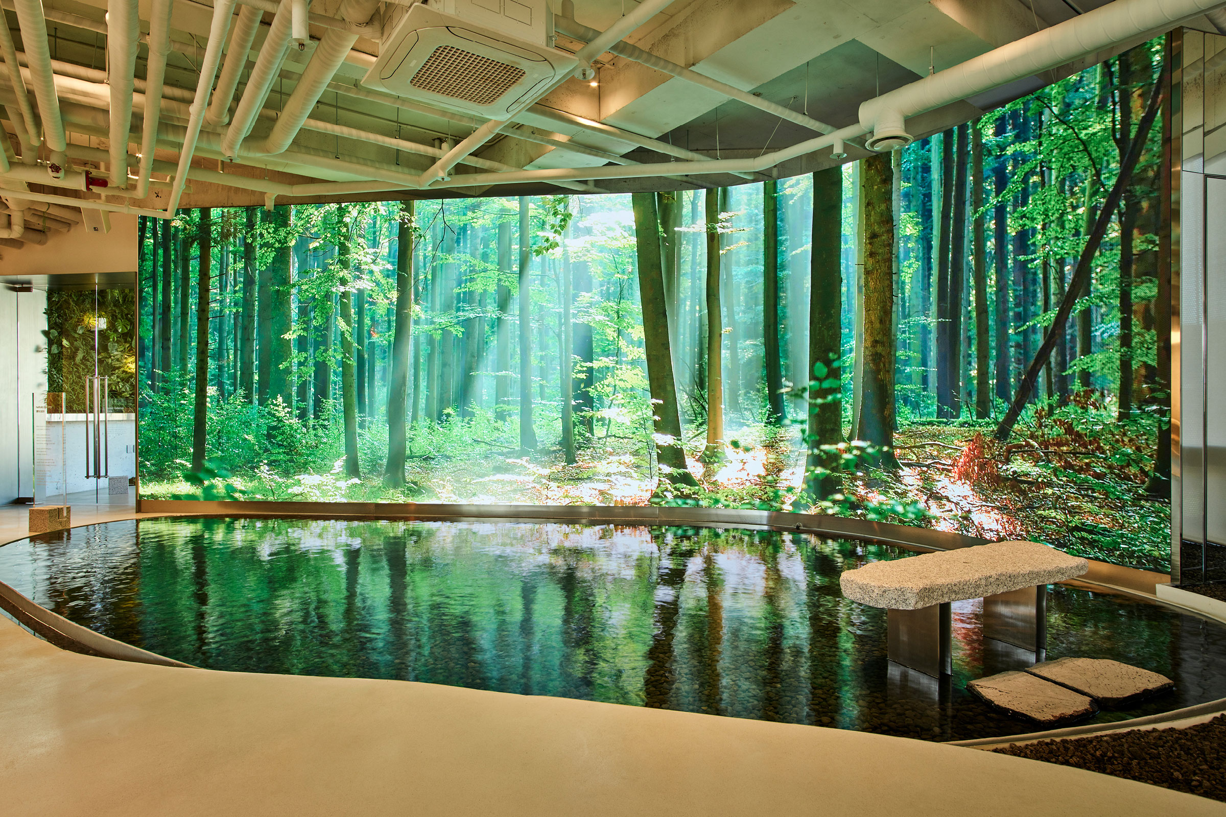
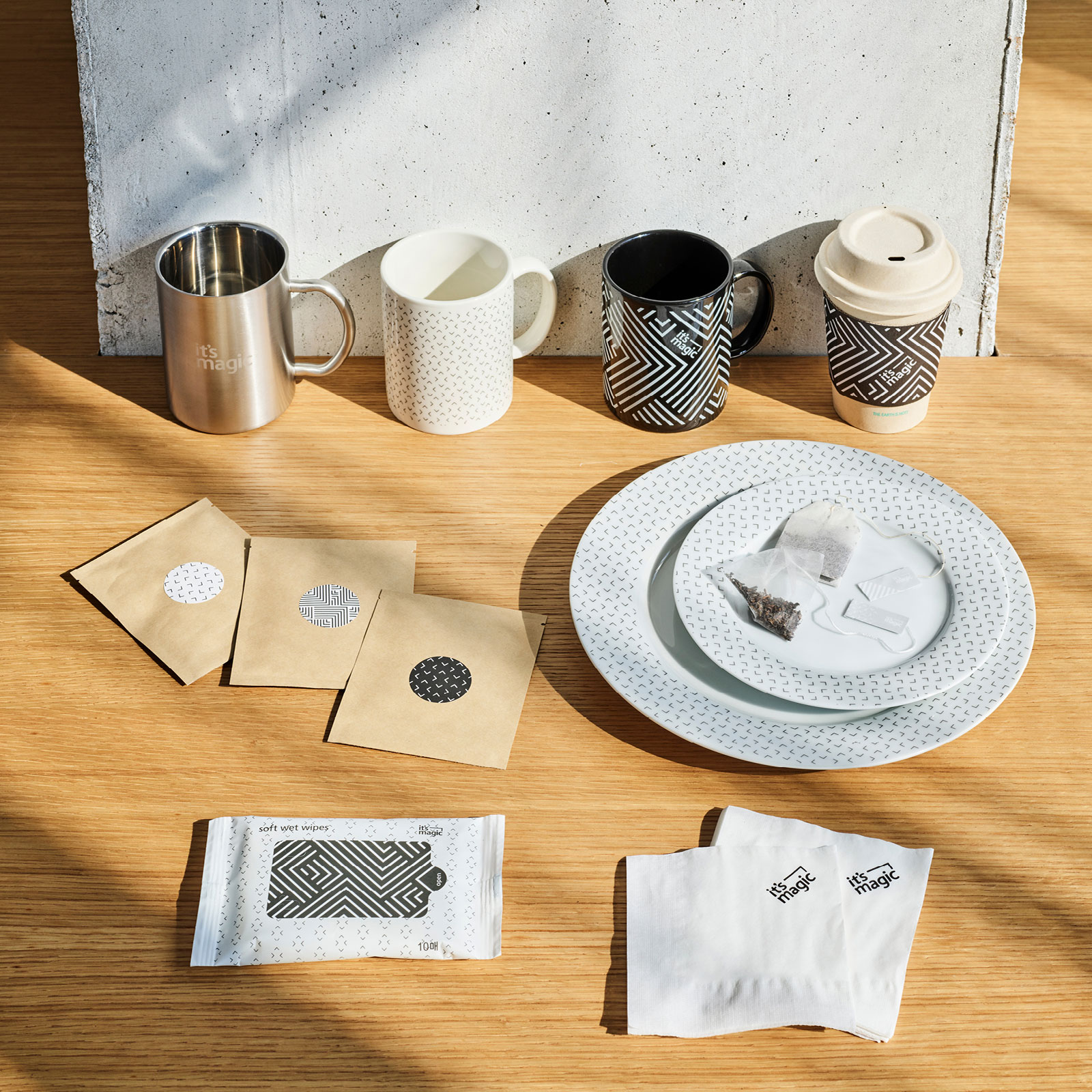
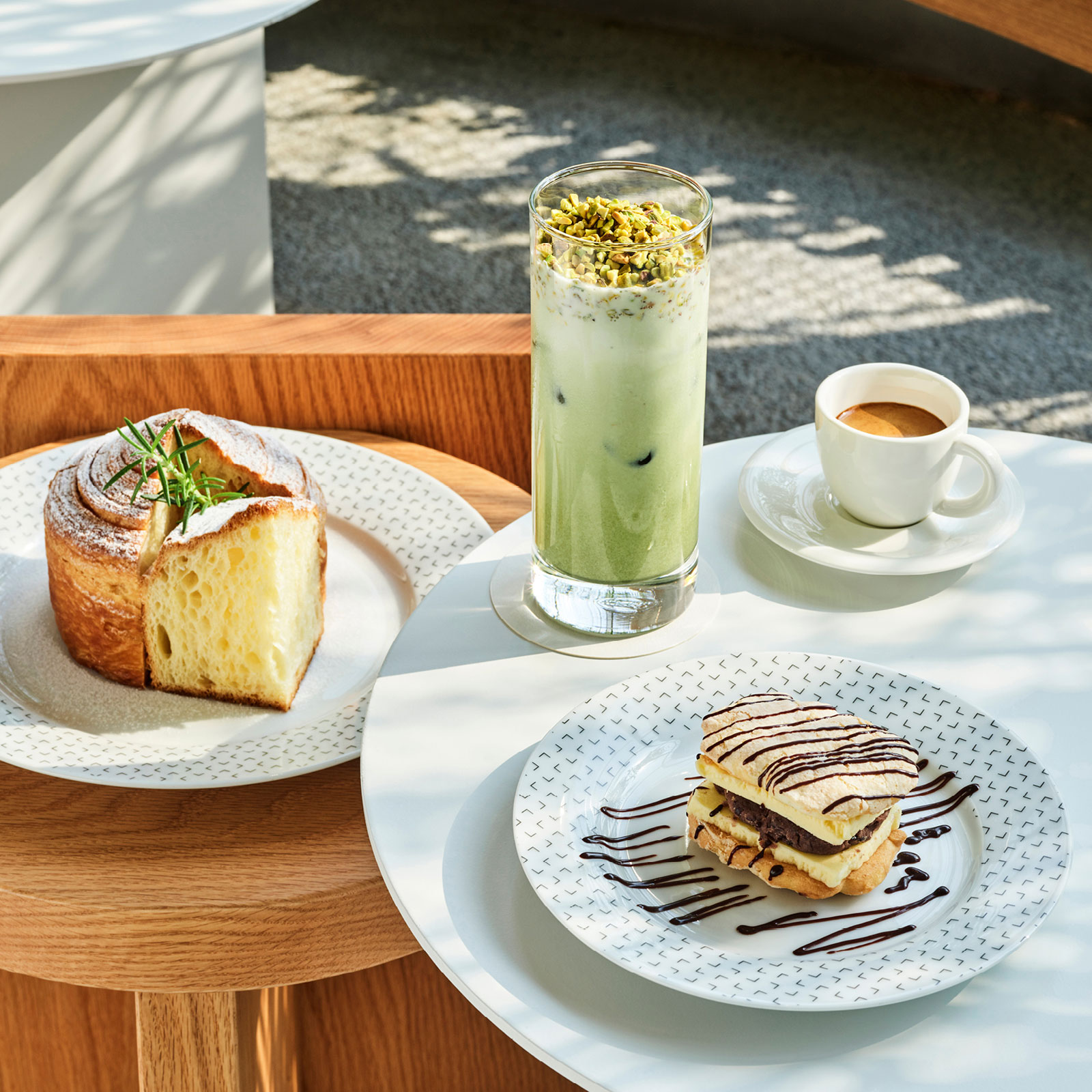
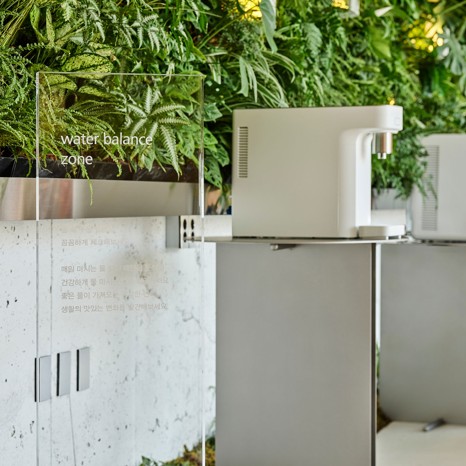
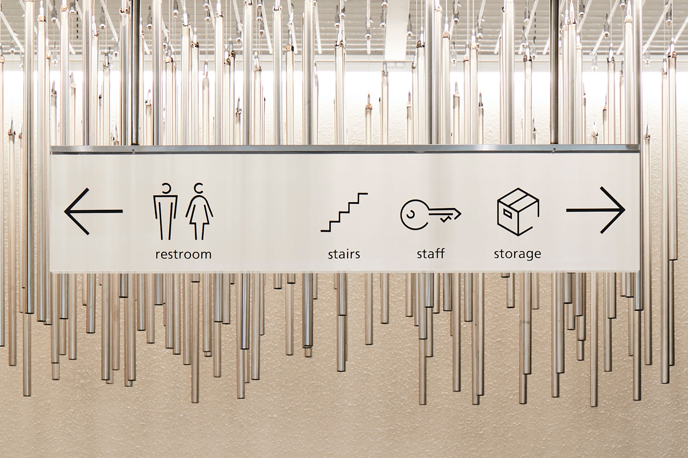
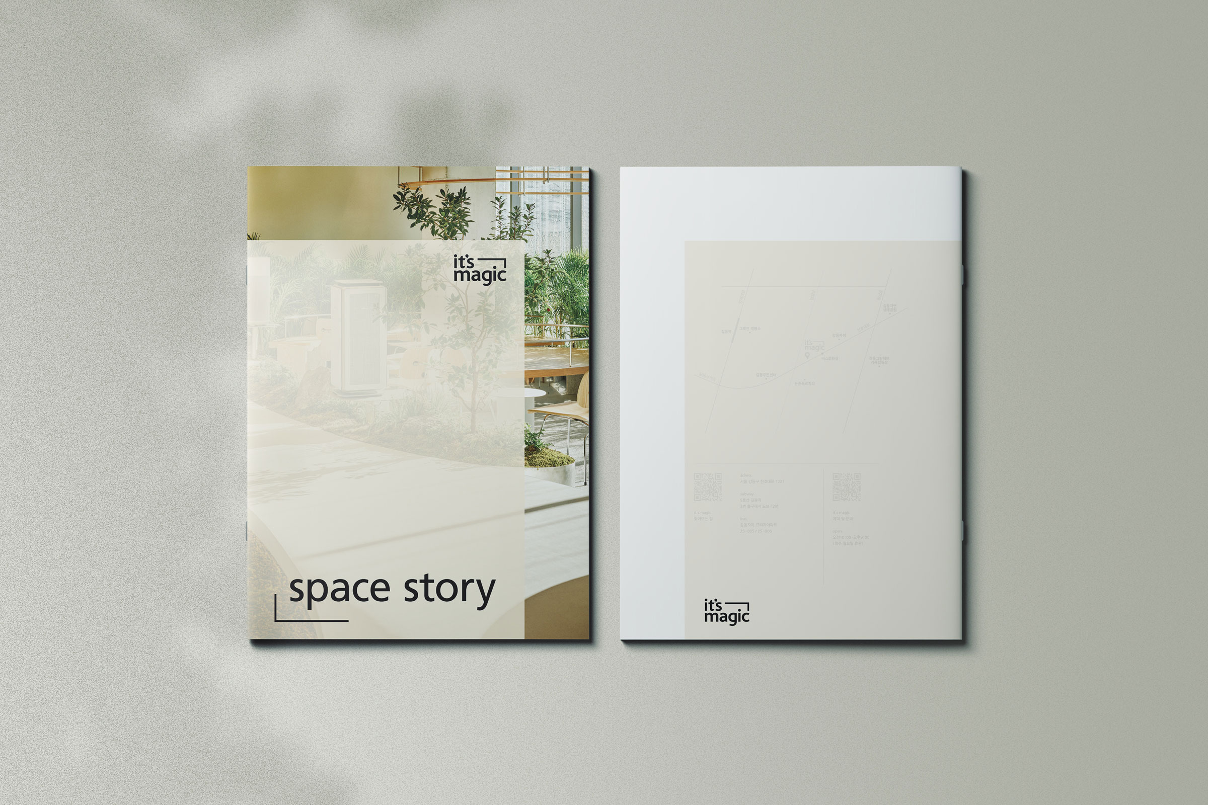
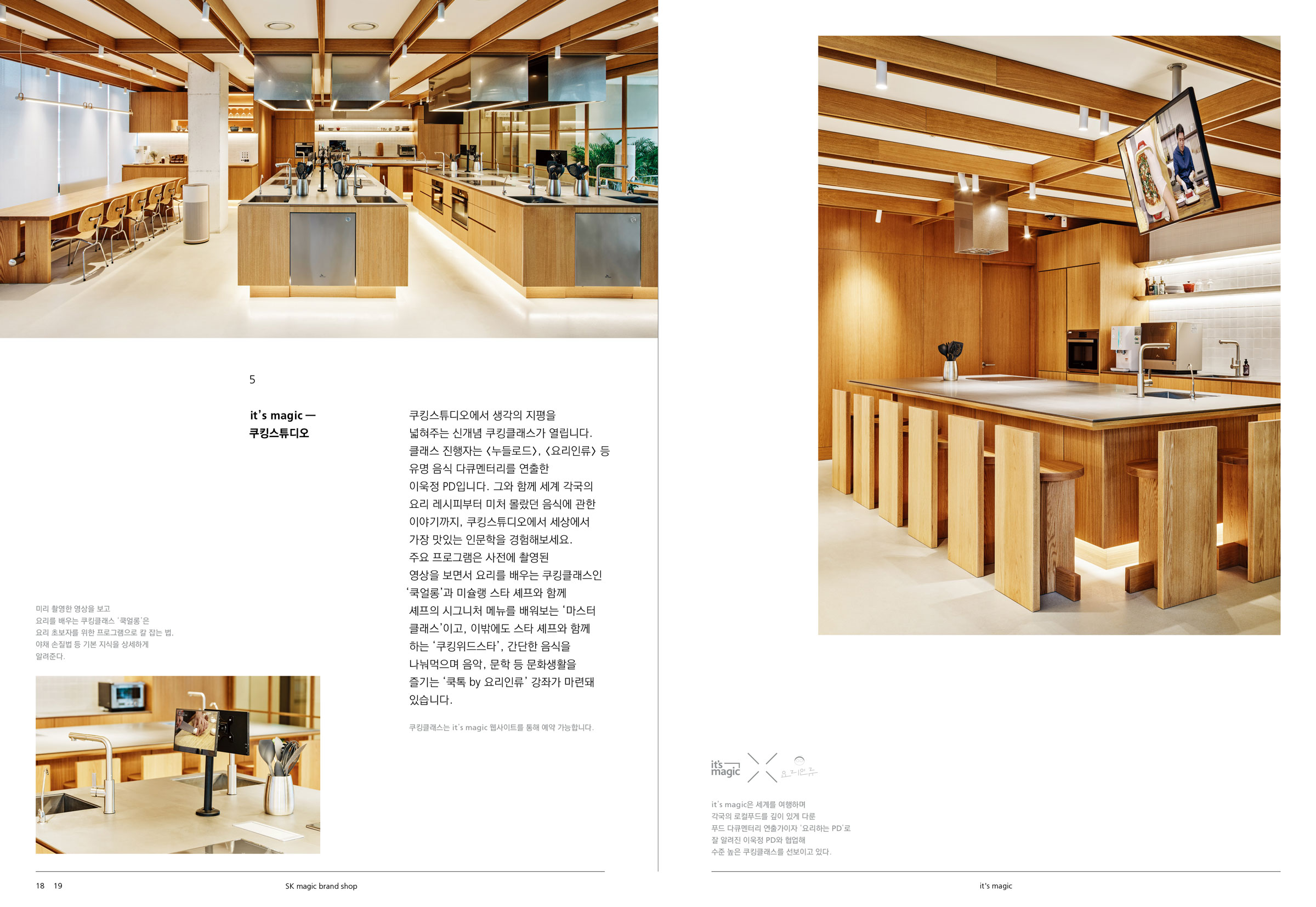
SK매직의 브랜드숍 <it’s magic>을 위한 그래픽과 공간 어플리케이션을 디자인했습니다. 기존의 브랜드 아이덴티티를 확장하여 <Magical Edge>라는 컨셉을 적용했으며, 에지 형태의 선들이 모여 하나의 공간을 이루도록 시각화했습니다. 이를 통해 확장과 축소, 개방과 폐쇄를 반복하는 변화의 힘을 어플리케이션 디자인에 담아냈습니다. 또한, 사이니지를 비롯해 F&B 공간을 위한 식기 디자인, 브랜드를 알릴 수 있는 리플렛과 브로슈어, 앱 개발을 위한 어플리케이션 가이드까지 함께 제작하여 브랜드 경험을 더욱 풍성하게 만들었습니다. 이러한 디자인의 혁신성과 완성도를 인정받아 2021년 레드닷 디자인 어워드에서 수상의 영예를 안았습니다.
BI 어플리케이션
SK매직의 브랜드숍 <it’s magic>을 위한 그래픽과 공간 어플리케이션을 디자인했습니다. 기존의 브랜드 아이덴티티를 확장하여 <Magical Edge>라는 컨셉을 적용했으며, 에지 형태의 선들이 모여 하나의 공간을 이루도록 시각화했습니다. 이를 통해 확장과 축소, 개방과 폐쇄를 반복하는 변화의 힘을 어플리케이션 디자인에 담아냈습니다. 또한, 사이니지를 비롯해 F&B 공간을 위한 식기 디자인, 브랜드를 알릴 수 있는 리플렛과 브로슈어, 앱 개발을 위한 어플리케이션 가이드까지 함께 제작하여 브랜드 경험을 더욱 풍성하게 만들었습니다. 이러한 디자인의 혁신성과 완성도를 인정받아 2021년 레드닷 디자인 어워드에서 수상의 영예를 안았습니다.
it’s magic
BI application
We designed the graphics and spatial applications for SK magic’s brand shop, <it’s magic.> Expanding upon the existing brand identity, we introduced the concept of <Magical Edge>, where edge-shaped lines come together to form a cohesive space. This visual approach embodies the dynamic forces of transformation—expanding and contracting, opening and closing—within the application design. Additionally, we designed signage, tableware for the F&B section, promotional materials such as leaflets and brochures, and an application guide to support app development, enhancing the overall brand experience. Recognized for its innovation and design excellence, it’s magic was honored with a reddot award 2021 winner.
2021 SK magic / ahn graphics
edge system,
graphic, signage, F&B,
brochure
edge system,
graphic, signage, F&B,
brochure
design.
2mm, textor
contents plan.
archiv.press
photo.
gwayong lee
print.
garam art
2mm, textor
contents plan.
archiv.press
photo.
gwayong lee
print.
garam art
brand shop design signage f&b brochure leaflet textor 브랜드 디자인 사이니지 브로슈어 리플렛 디자인 텍스토