광주문화재단
브랜드 북
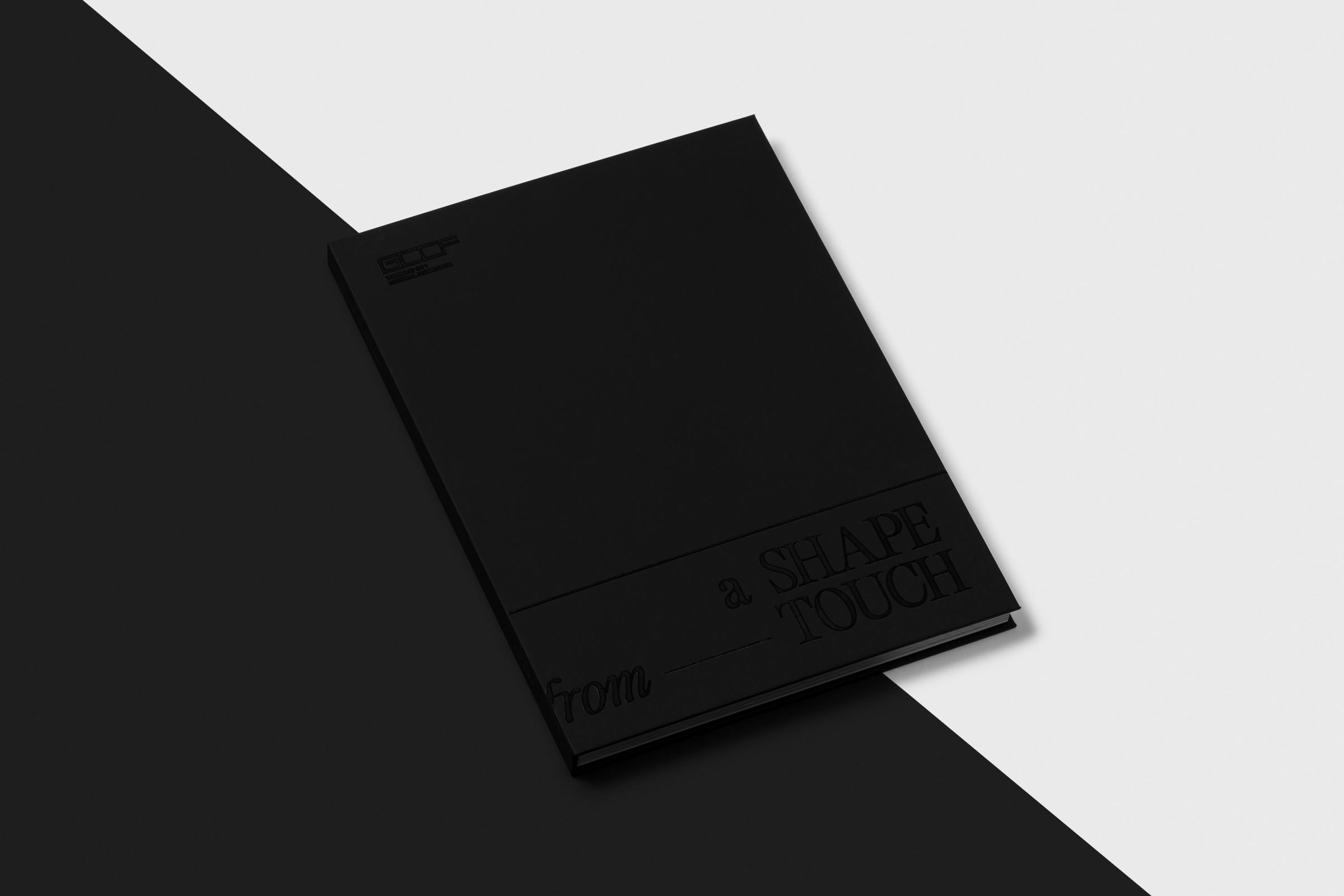
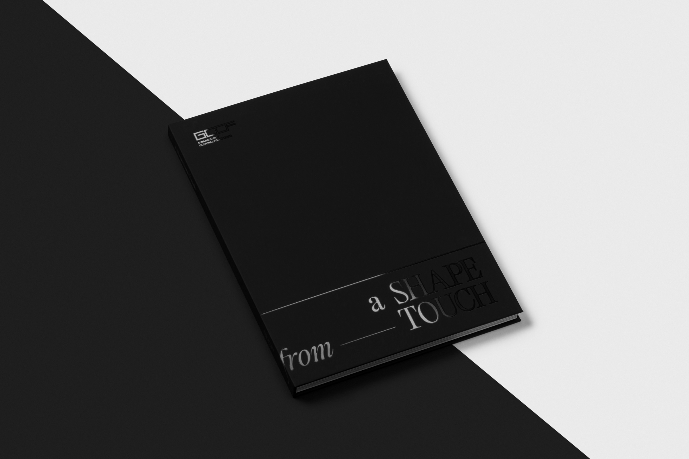
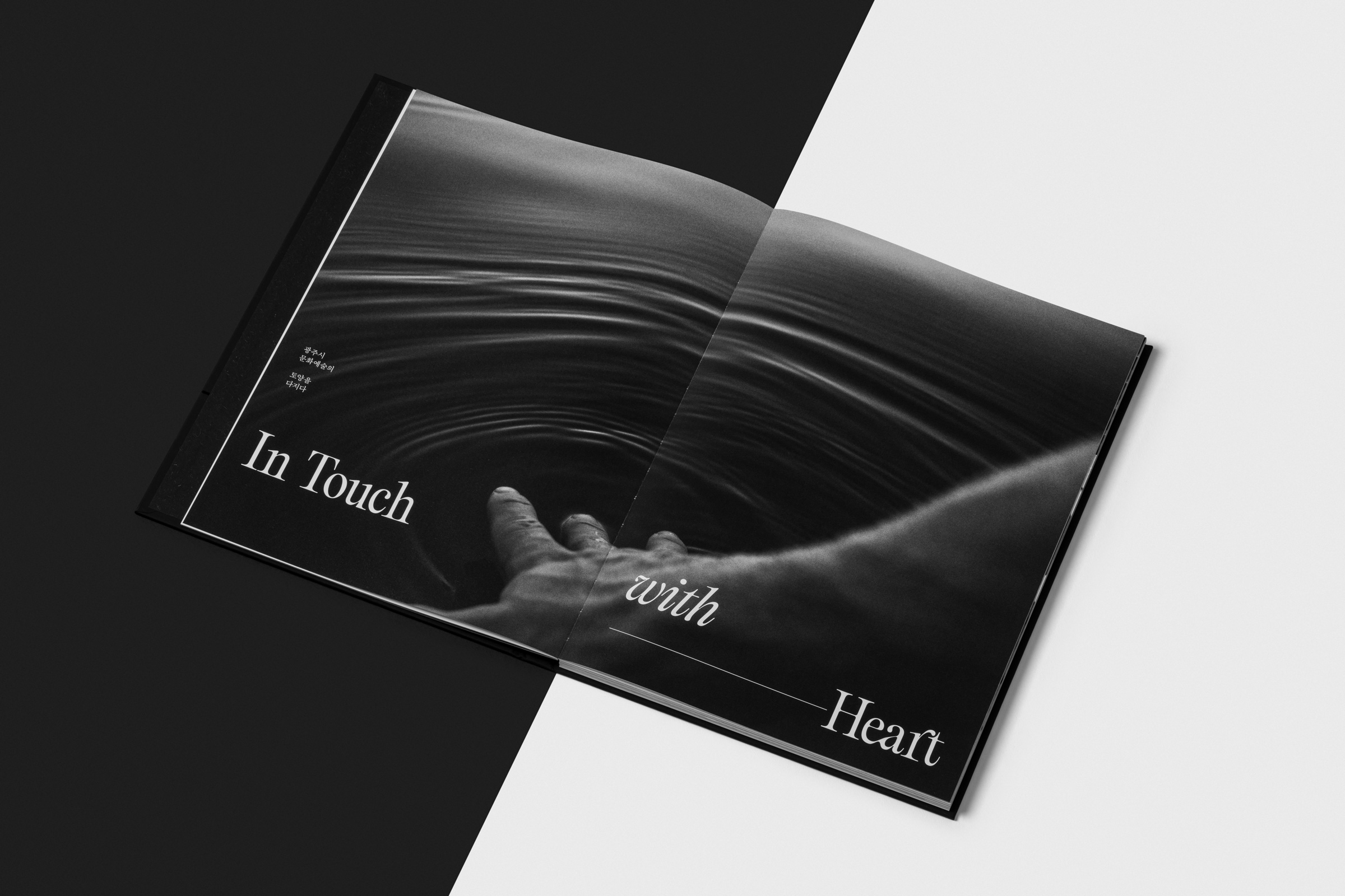
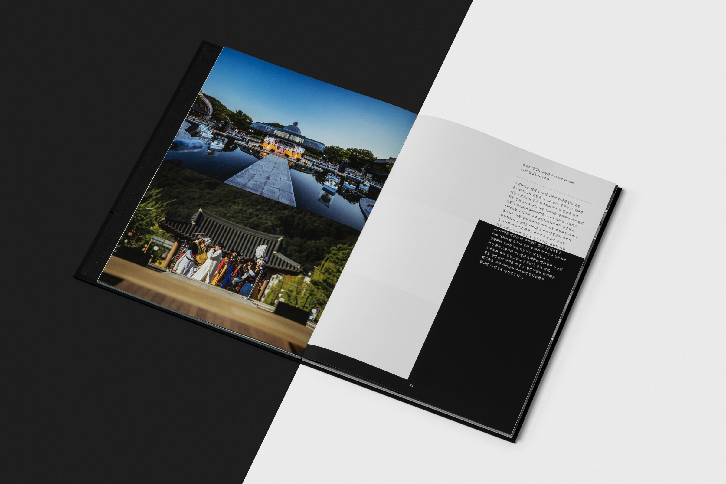
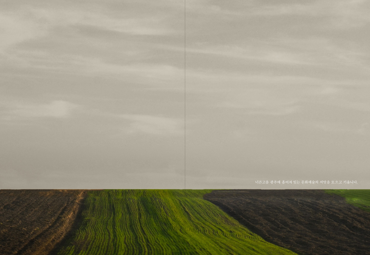
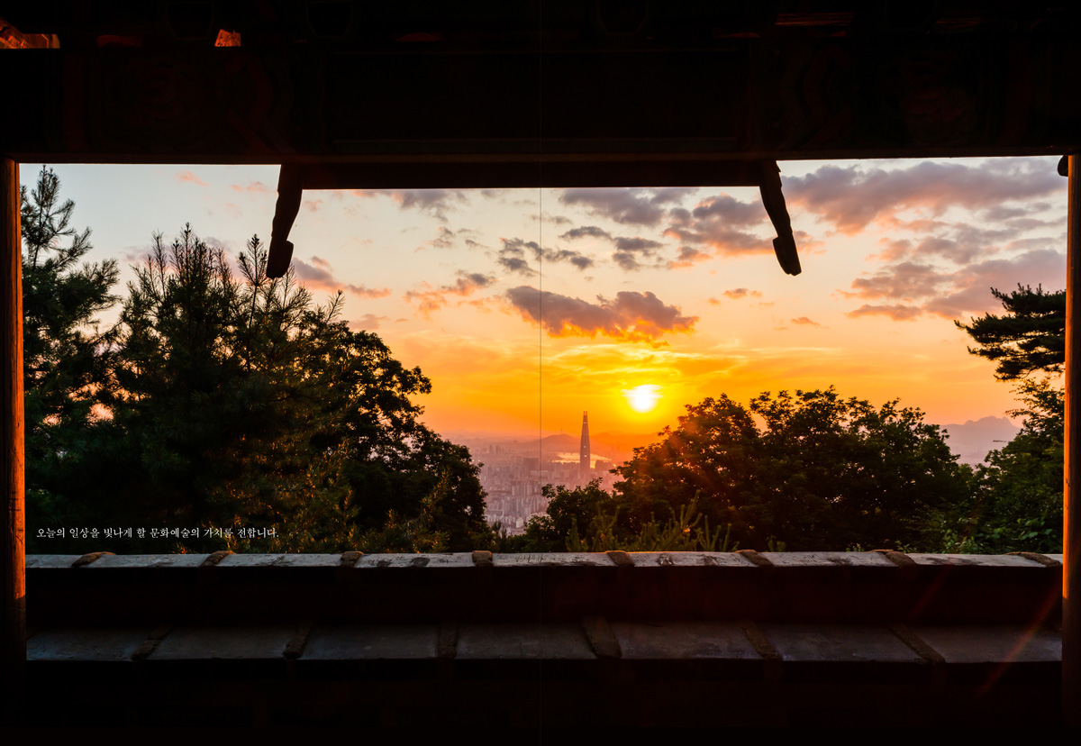
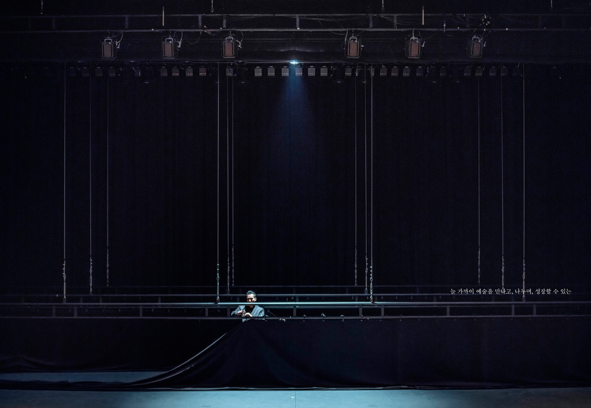
시민들에게 문화의 힘과 예술의 향기를 불어넣는 광주시문화재단을 위한 브랜드북을 디자인했습니다. ‘너른 평야’라는 뜻을 지닌 경기도 광주는, 과거 평야에서 땀 흘리던 농부들의 손길에서 시작해 왕의 그릇을 빚던 예술가들의 손길을 거쳐, 오늘날 문화예술의 다양한 표현으로 확장해 나가고 있습니다. 이러한 광주의 정체성과 방향성을 담아 ‘손길(Touch)’을 브랜드북의 핵심 컨셉으로 설정하고, 이를 중심으로 디자인을 전개했습니다. 표지에는 감온 잉크를 사용하여 사용자의 손길이 닿으면 글씨가 서서히 드러나도록 디자인해, ‘손길(Touch)’이라는 컨셉을 직관적으로 경험할 수 있도록 했습니다. 내지에서는 지평선이 확장되는 느낌을 시각적으로 구현하기 위해 수평과 수직의 선적 요소를 활용하여 광주의 열린 가능성과 확장성을 표현했습니다.
브랜드 북
시민들에게 문화의 힘과 예술의 향기를 불어넣는 광주시문화재단을 위한 브랜드북을 디자인했습니다. ‘너른 평야’라는 뜻을 지닌 경기도 광주는, 과거 평야에서 땀 흘리던 농부들의 손길에서 시작해 왕의 그릇을 빚던 예술가들의 손길을 거쳐, 오늘날 문화예술의 다양한 표현으로 확장해 나가고 있습니다. 이러한 광주의 정체성과 방향성을 담아 ‘손길(Touch)’을 브랜드북의 핵심 컨셉으로 설정하고, 이를 중심으로 디자인을 전개했습니다. 표지에는 감온 잉크를 사용하여 사용자의 손길이 닿으면 글씨가 서서히 드러나도록 디자인해, ‘손길(Touch)’이라는 컨셉을 직관적으로 경험할 수 있도록 했습니다. 내지에서는 지평선이 확장되는 느낌을 시각적으로 구현하기 위해 수평과 수직의 선적 요소를 활용하여 광주의 열린 가능성과 확장성을 표현했습니다.
GCCF
brand book
We designed a brand book for the Gwangju City Cultural Foundation, bringing the power of culture and the essence of art to the city of Gwangju. The name "Gwangju" in Gyeonggi Province means "vast plains," symbolizing a journey from the hands of farmers who once cultivated the fields, to the hands of artisans who crafted royal ceramics, and now to the hands shaping diverse cultural and artistic expressions. Embracing this evolution, we developed the concept of "Touch" as the central theme of the brand book. For the cover, thermochromic ink was used so that text gradually appears when touched, allowing users to experience the theme firsthand. Inside, horizontal and vertical linear elements were incorporated to visually extend the horizon, symbolizing Gwangju’s openness and continuous expansion in culture and the arts.
2024 GCCF
205 x 290 mm
122 p
205 x 290 mm
122 p
design.
chansei nam, bobae kim
edit.
youngin won
print.
garam art
chansei nam, bobae kim
edit.
youngin won
print.
garam art