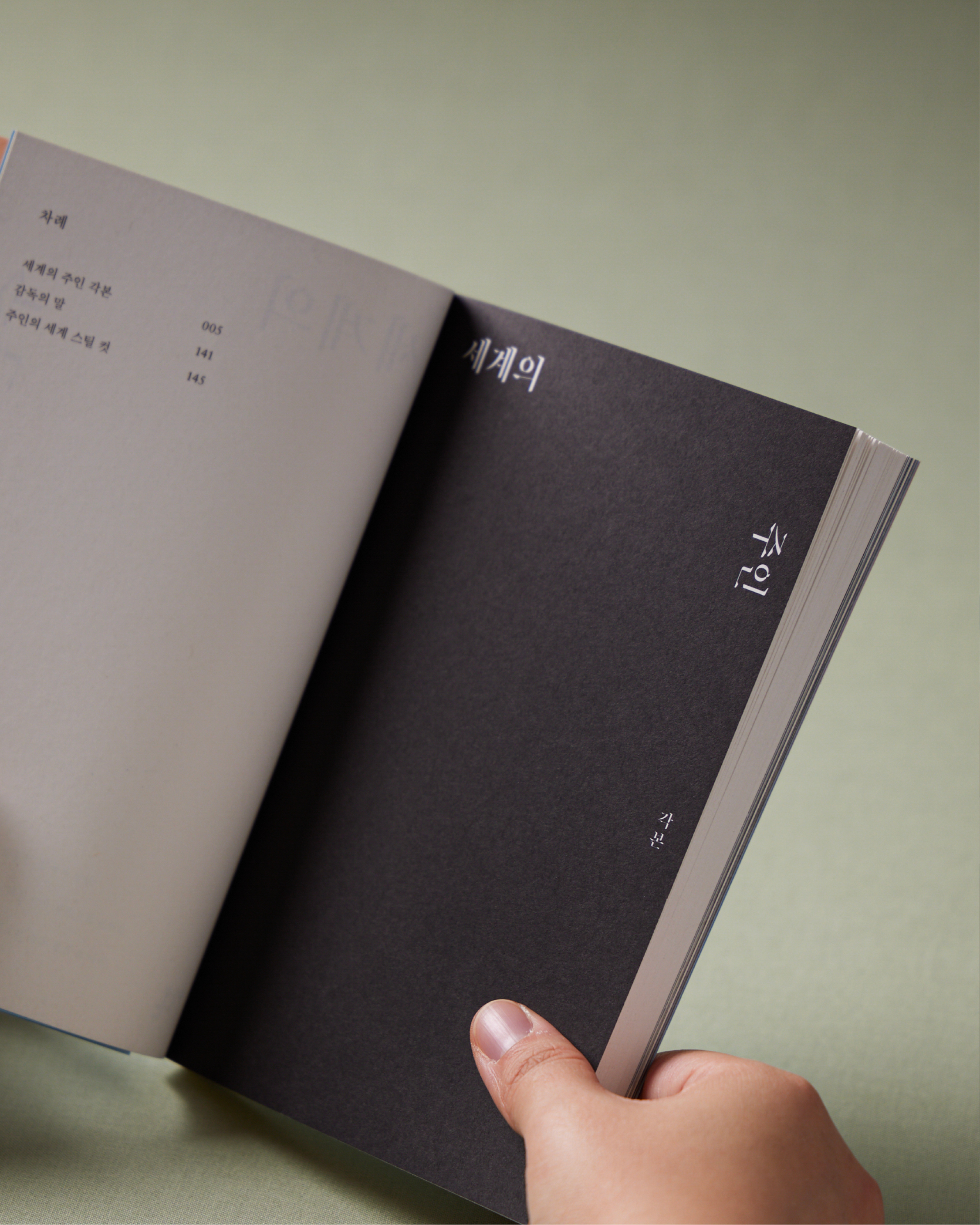
세계의 주인 각본집
안온북스
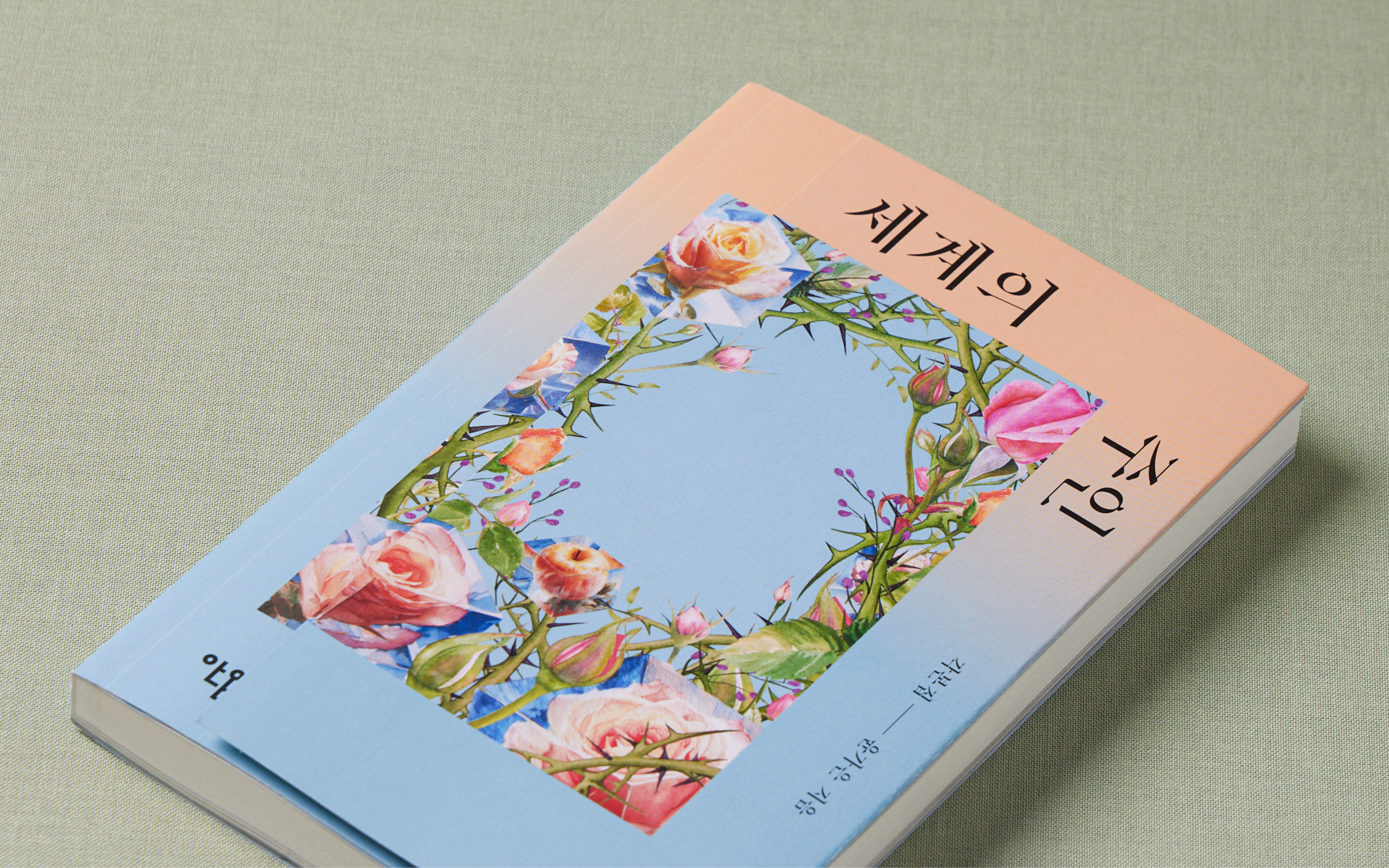
영화 <세계의 주인>이 다루는 판단과 인식의 뒤틀림을 시각화하기 위해, 우리는 책의 물리적 구조를 비트는 시도를 했습니다. 일반적인 방식과 반대로 설계된 '역방향 날개(Inverted Flap)'는 영화가 가진 전복적인 서사를 직관적으로 드러내는 장치입니다.
날개를 펼치는 행위에 따라 제목은 <세계의 주인>에서 <주인의 세계>로 교차됩니다. 이러한 구조적 전환은 외부의 시선과 내면의 진실 사이에서 발생하는 팽팽한 긴장감을 상징하며, 독자가 책을 만지는 물리적 경험을 통해 영화의 주제 의식에 도달하도록 유도합니다.
표지 디자인에서는 주인공의 얼굴을 비워두는 절제된 방식을 택했습니다. 이는 감독의 의도를 시각적으로 투영한 결과로, 특정 인물의 형상을 지우고 비워진 공간을 만듦으로써 독자 스스로가 그 자리에 투영되어 각자의 세계를 구축하는 주체가 되기를 바라는 중립적 사유의 공간을 의미합니다.
안온북스
영화 <세계의 주인>이 다루는 판단과 인식의 뒤틀림을 시각화하기 위해, 우리는 책의 물리적 구조를 비트는 시도를 했습니다. 일반적인 방식과 반대로 설계된 '역방향 날개(Inverted Flap)'는 영화가 가진 전복적인 서사를 직관적으로 드러내는 장치입니다.
날개를 펼치는 행위에 따라 제목은 <세계의 주인>에서 <주인의 세계>로 교차됩니다. 이러한 구조적 전환은 외부의 시선과 내면의 진실 사이에서 발생하는 팽팽한 긴장감을 상징하며, 독자가 책을 만지는 물리적 경험을 통해 영화의 주제 의식에 도달하도록 유도합니다.
표지 디자인에서는 주인공의 얼굴을 비워두는 절제된 방식을 택했습니다. 이는 감독의 의도를 시각적으로 투영한 결과로, 특정 인물의 형상을 지우고 비워진 공간을 만듦으로써 독자 스스로가 그 자리에 투영되어 각자의 세계를 구축하는 주체가 되기를 바라는 중립적 사유의 공간을 의미합니다.
the world of love screenplay book
anon books
To visualize the distortion of judgment and perception explored in the film The World of Love (Korean title: The Master of the World), we experimented with twisting the physical structure of the book. The 'Inverted Flap,' designed in the opposite direction of a conventional fold, serves as a tactile device that intuitively reveals the film’s subversive narrative.
As the flap unfolds, the Korean title shifts from The Master of the World (<세계의 주인>) to The World of the Master (<주인의 세계>). This structural transition symbolizes the taut tension between the external gaze and internal truth, guiding readers to encounter the film’s core themes through the physical experience of handling the book.
For the cover design, we employed a minimalist approach by leaving the protagonist’s face blank. This is a visual manifestation of the director’s intent: by erasing specific features and creating a void, the design offers a neutral space where readers can project themselves, becoming the subjective "masters" of their own worlds.
2025
anon books
124 x 189mm
176p
anon books
124 x 189mm
176p
design.
chansei nam, yeonsu nam, bobae kim
print.
garam art
chansei nam, yeonsu nam, bobae kim
print.
garam art
book design movie book textor 북디자인 브랜드 매거진 편집디자인 단행본디자인 텍스토